brand identity
Time travelling rebels against reality

Client: Hammer & Tong
Role: I worked as Brand Consultant and Creative Director
Hammer & Tong are a growing Vancouver Extended Reality production house developing narrative content for film, as well as virtual and augmented reality. Their founders and diverse team share one clear vision: to creatively harness innovative technology, and through it tell socially relevant stories.
H&T found themselves in a common situation for busy startups - most of their time was spent on client work, with little to spare on their own brand. They were, as far as web presence goes, almost invisible. The groundwork, such as origins, brand story, vision, mission and desired trajectory for company culture had been successfully completed, but not implemented yet.

↑ still from supernatural short ‘Sisters of Sorrow’
“The light goes out. We live in the shade.”

↑ still from supernatural short ‘Sisters of Sorrow’
THE BRIEF
I was tasked to capture the unusual, energetic and fiercely independent brand personality of the studio, and to surface its inner workings. This would then take shape as a digital Brand Style Guide, as well as initial ideas for phase 1 of a new website.
MY ROLE
I worked as Creative Director and Brand Identity Consultant.
CVLT
From the start, the H&T vibe felt similar to a cult movie - a creative and deeply original content provider, primed to tell memorable stories ranging from period horror to sci-fi utopia. Their brand had to reflect these qualities - be quirky and not too formal, yet also be intriguing and a little mysterious. As they operated in a pioneering tech sector, the look and feel of any digital presence needed to be memorable, cutting edge and confident.
I began my visual research by exploring recurring themes resonating in the H&T sphere:
arthouse, sci-fi, cyber- and solarpunk, and those lucid dream worlds.

↑ visual research: Surrealism in movies
“We love to engage and transport people to different points in time - the closest thing to time travel we can think of.”

↑ visual research: Solarpunk
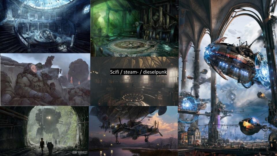
↑ visual research: Sci-Fi, Steampunk, Dieselpunk


↑ still from Chinatown XR experience

“Creativity is all
about collaboration
and collaboration is
all about respect.”

↑ still from supernatural short ‘Sisters of Sorrow’

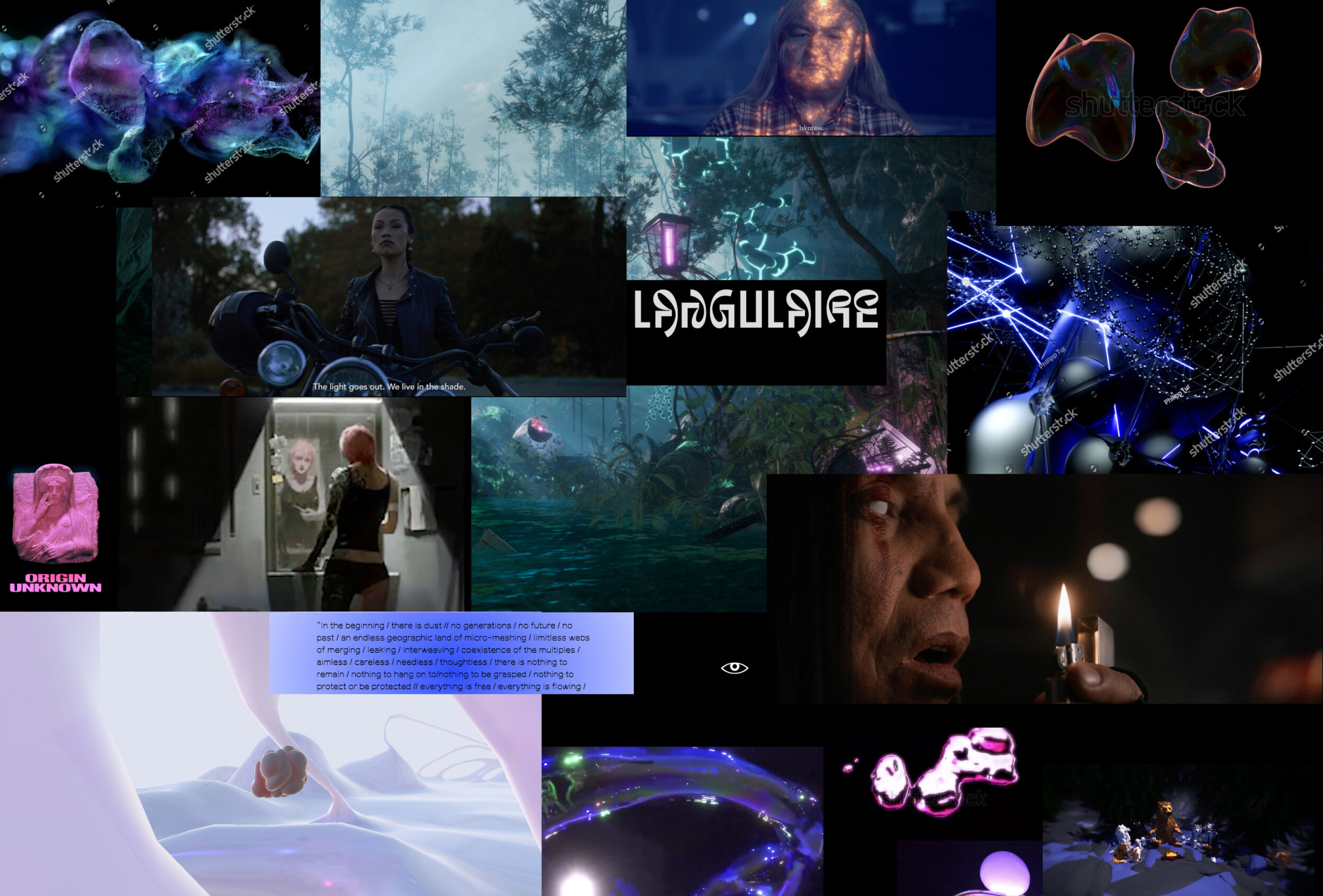
↑ visual research: Lucid dream worlds
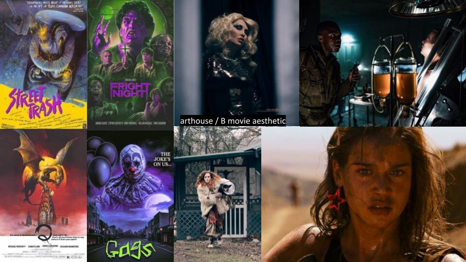
↑ visual research : arthouse and B Movie aesthetic
TRAVERSE THE VOID
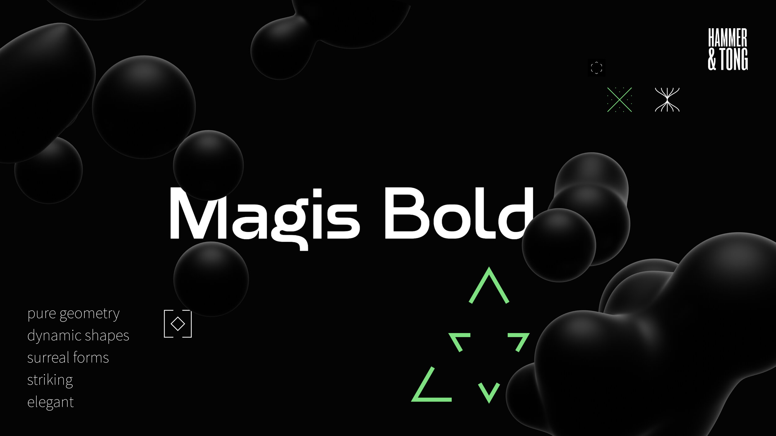
With the research phase concluded, we agreed to move forward with the concept of ‘Travellers of Edge Realities’ - a deliberately surreal, fluid and flexible feel: strikingly dark and elegant shapes disrupted by bold modern typography and geometric illustration.
A style designed to tell stories of the future.
↑ visual research moodboard: shapes, colours, typography
Core Colours
‘Slate’ and ‘Snow’ are the leading colors in a predominantly monochrome scheme, and are used to give balance to the interface. White, considered to be pure and clean, is the blending of all, black the absence of any colour: the ‘Void’, associated with the mysterious and unexplained. The palette is contrast rich, and works as one harmonious set, with the primary purpose of enhancing the user experience.

↑ Style Guide: Core colors

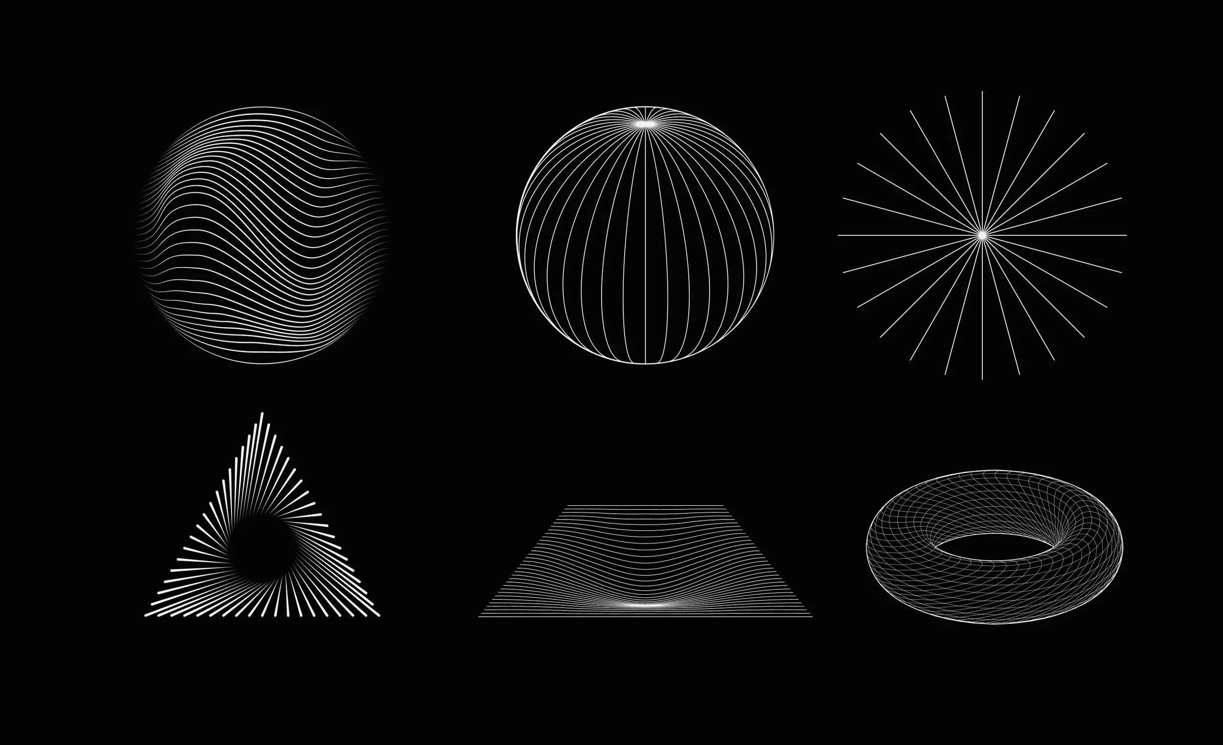
↑ Style Guide: Abstract 3D elements

↑ Style Guide: Icons
ICONOGRAPHY
Two types of icons each serve a different purpose: Enhanced Icons give character to the interface - the abstract shapes complement existing brand elements and line illustrations, and can further customize the look and feel of a page. System Icons aid information distribution and wayfinding, and an open source Material Design Icons Library plugin for Figma was used throughout.
↑ Style Guide: Illustration
ILLUSTRATION and 3D elemeNts
Experiences can engage and transport people to different points in time. Illustrations and abstract 3D elements are a reflection of this movement - abstract vortices, wormholes, interstellar travel portals through dimensions in time and space.
Multifaceted and ever changing abstract shapes offer a surreal environment similar to a soft, floating dreamlike state, undulating in space as a user moves past. In later phases of development, the 3D elements could be used in a playful, interactive way, to further enhance the user experience.

↑ Style Guide: Assembled elements
↑ Style Guide: Assembled elements
DISCLAIMER
All visual research materials within this case study are used for visualisation purposes only, and remain the IP of their creators.
COLLABORATORS:
Binoodha Kunnath, Senior UX Researcher
Ghazal (Q) Jenab, Product Designer
Willow Browne, Junior Designer