ui + app design
Perfect PX doesn’t exi…
Client: Perkbox
My role: I worked as Lead User Interface Designer and Brand Designer
Brief: set up a design system in 10 days. Achievable - given a solid set of digital brand guidelines or established visual language. Lacking that, utilise output from a design direction workshop or, at the very least, have a good idea of where the look and feel of the UI should head, given company strategy and vision.
There was none of the above.
WHO, AND WHY ARE PERKBOX?
Perkbox are a people experience platform and a positive, progressive product company.
Their own people are critical thinkers and creative problem solvers; a modern, energetic workforce with wide ranging interests, which naturally enrich culture, wellbeing, support and performance.
The leadership team work towards a vision of building a better society and strengthening their clients’ organisations from the inside by empowering their people. To do so, they continually investigate what drives an employee’s experience at work, and motivates and challenges a team.
They currently redefine PX for business customers across a large variety of sectors, and work closely with Trainline, Deliveroo, Purple Bricks, Holland & Barrett, Rentalcars and Wasabi, to name but a few.


HOW TO PX
New open plan offices, well stocked V/VG friendly fridges, premium coffee ✔️
’Happiness Lab’ chillout area, beer tables, sofas, pool- and ping-pong tables, game station ✔️
Regular Yoga sessions, wellbeing and mental health workshops ✔️
Monthly high-profile external speakers, info sessions, launchpad events for n00bs ✔️
Epic Slack bantz on the P+E channels 🦈
Office dogs, frequency capped to only 5 per day 😀

↑ Perkbox brand values

↑ 3 office espresso machines 👀

↑ ambient ‘office vibe’ video still

↑ pre-presentation huddle

↑ smol ISO inspector: Reggie

↑ deceptively empty Musical Couches

↑ what is it with the unicorns

↑ squishy gremlin: Daisy

↑ game buddies 4 lyfe

↑ anagram alert

↑ first-in-show sploot: Mila

↑ Mr. Steal Your Girl: Bernard
MIX AND MATCH
I joined Perkbox at an intriguing juncture: the profound shift from a local, single product B2B employee happiness provider, to a global, multi-product, B2B2C Employee Experience platform.
To complicate matters a tad further, a brand refresh had been kicked off by visionary Head of Creative Karla Mulder and her team.
A number of nascent products had recently been established, each bolstered with dedicated squads of product managers, designers and a merge conflict of engineers.
Voracious product growth at ludicrous speed had inevitably resulted in some hefty UI design debt.
It was time to pay. 💸
To be able to elevate a brand, one needs to learn about its visual roots.
To appreciate an organisation’s heritage, a deep dive brand audit is always a good start. This includes recording, and evaluating, current on- and offline visual presence, across as many channels as possible, in as little time as necessary to get reliable results.
Then, company purpose and mission become the cornerstones amidst which to place impressions of spaces, people and ways of working.
“Once you eliminate the impossible, whatever remains, no matter how improbable, must be the truth”
A combination of all the above then becomes part of the systematic process of capturing the today, and the inception of the creative process of outlining the potential tomorrow for a brand, product, and subsequent UI system.
TL;DR: UI consistency fail requires analysis
↑ proposed structure + sections, first draft
PROGRESS IS THE PROCESS
Fast forward 10 days: my solid skeleton structure of a design system was in place, but no sufficiently evolved brand elements available to apply to it yet ¯\_(ツ)_/¯ We decided to park it.
I was repositioned to work on enhancing the new Perkbox Medical product, and work closely with the Marketing design team on the impending Brand Evolution.
Think big box
The Perkbox Brand Evolution became a rich, cross-team collaboration over a number of months, and resulted in a slow rollout of singular elements of the new visual language, which were rigorously tested in real world environments.
Below are some of the explorations and consecutive solutions produced.
Onboarding ILLUSTRATION
Enhanced iconography, utilising a curated selection of brand colours for the Perkbox Medical app


Brand colour refresh
The bold and the beautiful - now WCAG accessible

↑ Core brand colours
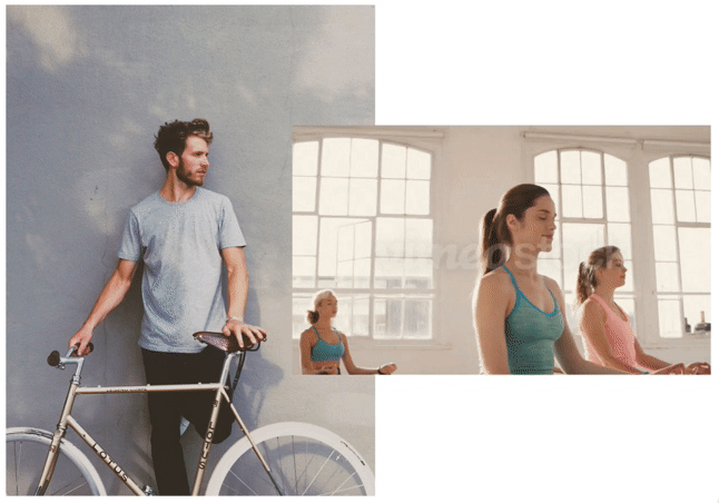
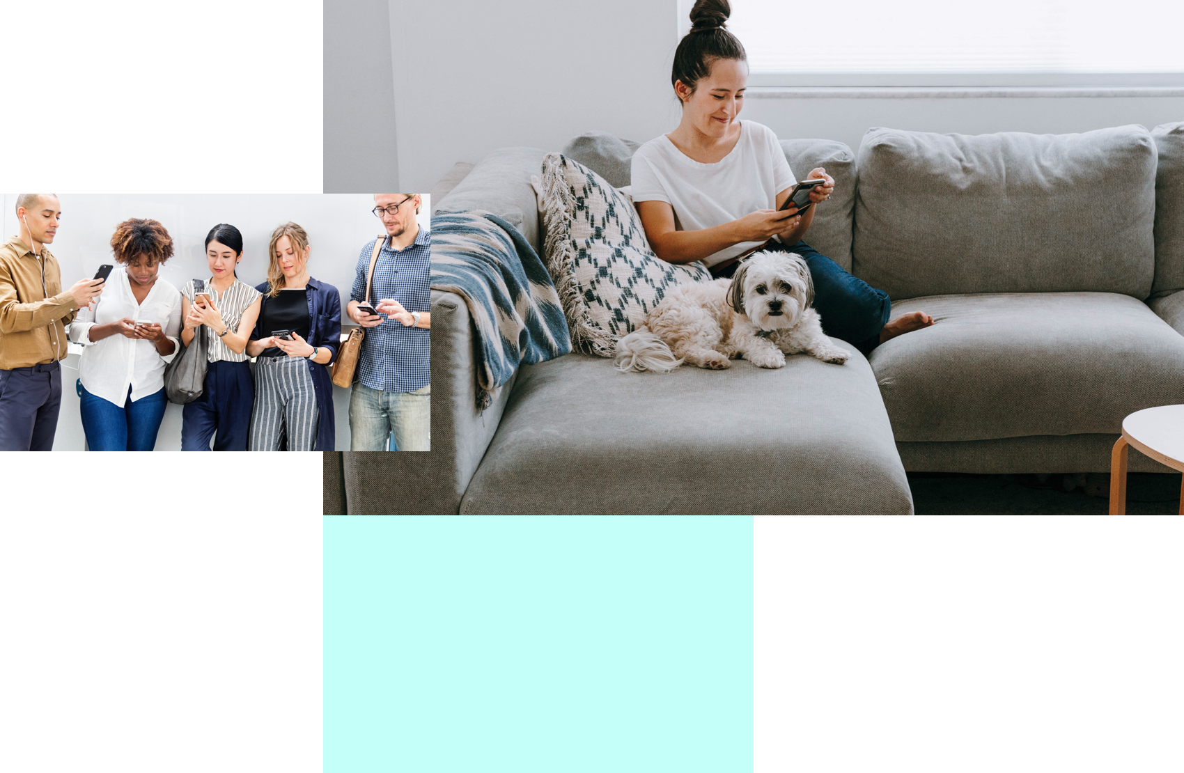
image stacks
Flexible 4:3 + 5:3 image ratio grid stacks to add motion and visual interest
brochureware
Seamlessly blending on- and offline brand experience

app ads
Clean clay devices on smooth organic background shapes

notifications
FOMO no mo! Opt-in permission screens


↑ The “New World” prototype designs
no loose ends: error page
0.2% edge cases? We got u

login screens
Gentle, organic shapes placed to emphasise content areas

COLLABORATORS:
Stephen Etheridge, Senior UX Designer
Bill Hewitt, Product Manager
Karla Mulder, Head of Creative
Sandeep Gill, Video Director
Paul Osborn, Product Design Lead
Elsa Bacchiolelli, UX Researcher
Sam Chelton, Product Designer
Daisy Harding, Product Designer
Mark Winter, Junior Product Designer
Evelyn Patsoule, UX Designer
Llewellyn van Eeden, Senior Designer
Jenny Crawford, Graphic designer