logo redesign pitch
Branding spatial workflows
Immersive collaborative sculpting tool: Gravity Sketch
Client: Gravity Sketch
My role: I worked as Creative Director and Brand Designer on a pitch project.
When I first took note, Gravity Sketch were a London-based tech startup at $2.8m seed stage, with an award winning, pro-level VR app that offers multiplayer artist co-sketching in real time, and has now evolved into a desirable global collaboration tool.
My research saw them firmly established within XR, immersive 3D software and 3D printing.
I was quite excited to get shortlisted for a UI Lead interview.
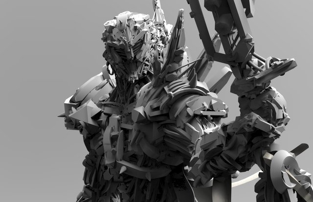
↑ VR work by concept artist manthosArt made in Gravity Sketch

↑ VR creation process by concept artist Pierre Raveneau in Gravity Sketch
AND SO IT BEGINS
Pitch requirements - to be completed within 2 days - were listed as follows:
Logo design for a fictional Mixed Reality [MR] company, including extensive documentation of all iterative design stages
UX and corresponding UI design for several screens of a 3D software cloud portal
mockups of the logo concept in a number of social channels
↑ typography research - legibility? overrated
↑ select sample of genre representative art

MIXED REALITY MOOBOARDING
visual research, timeboxed to 4 hrs 🕳️🚶🏽♀️
↑ exquisite renders of virtual world abstractions
WHAT’S OUT THERE?
I collated examples of established AR / VR / MR brands, emerging artists working in the medium now, web art magazines, virtual environs [see DiMoDa, the Digital Museum of Digital Art and MOR, the Museum of Other Realities], and followed a number of avatars + virtual personas, to get a better idea of a suitable look + feel for the new brand.
VISUALISING GRAVITY
Given the engaging product name, and its innovative application, inspiration didn’t lag far behind. ‘Gravity’ immediately conjured up images of planetary ring particles, disrupted satellite debris, Avatar’s Hallelujah Mountains floating in magnetic currents, children playing in a slow-mo gravity well in an abandoned house in the Animatrix, and the hyper-realistic space stories of Netflix’ Love, Death + Robots.
After a brief physics/maths/astronomy secondary research flyby, I had a tentative grasp on the subject of gravity, and assembled just enough conceptual input to sense a pull towards some dreamy, gravity-defying space rocks.
↑ brand design is totally rocket science
ALIEN EGGS
What’s better than regular space rocks? Alien space rocks. Fact.
I wanted the Gravity Sketch logomark to be captivating and visionary, to present the ultimate creative revelation, to embody a mysterious glimpse of the yet unseen.
A quick nose around 3D stores for assets didn’t get close to what I needed. My PSD mockups looked like, well… mockups. Time to collaborate.
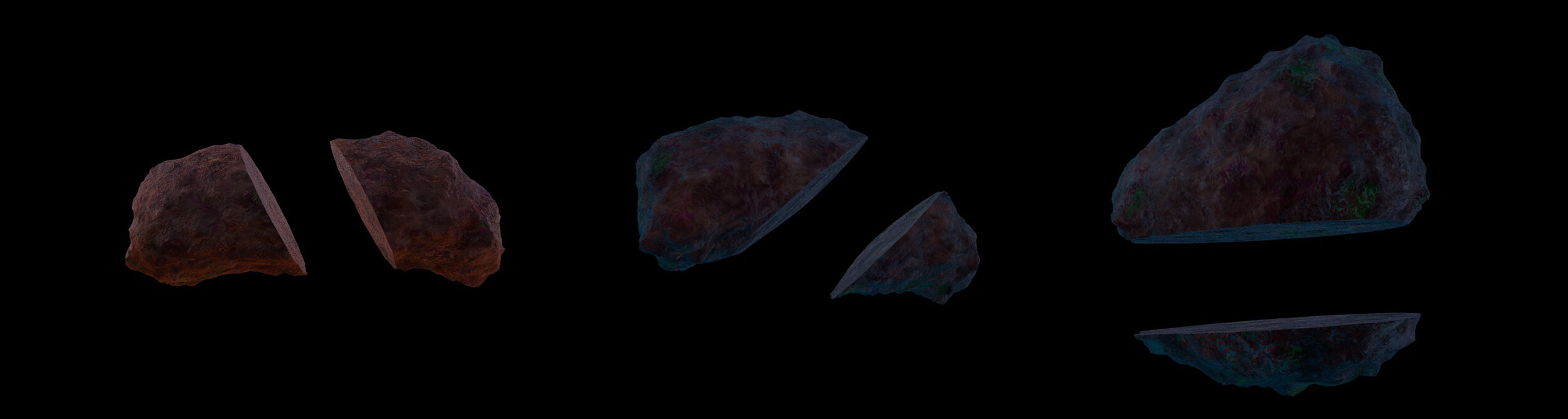
↑ ominous rocky renders, not-quite logo material

↑ yeeting rocks through terrestrial, even universal gravitation? WCGW
↑ The perfect Xenomorph egg omelette - original sculpture via Romain Langlois
↑ ‘creative juice’ = viscous alien space goo
SPACE POTATO PROTOTYPING
I got lucky, and in Cesar found a relaxed, confident and talented 3D artist, who wasn’t the slightest bit fazed at the complex task ahead. Excited about the concept, he was quick to make additional creative suggestions on how to improve colour palette, rock positioning and goo texture.
We initially focused on the ‘dry’ space rock, and cycled through a few potato-esque iterations:
↑ three stages of a baked space potato
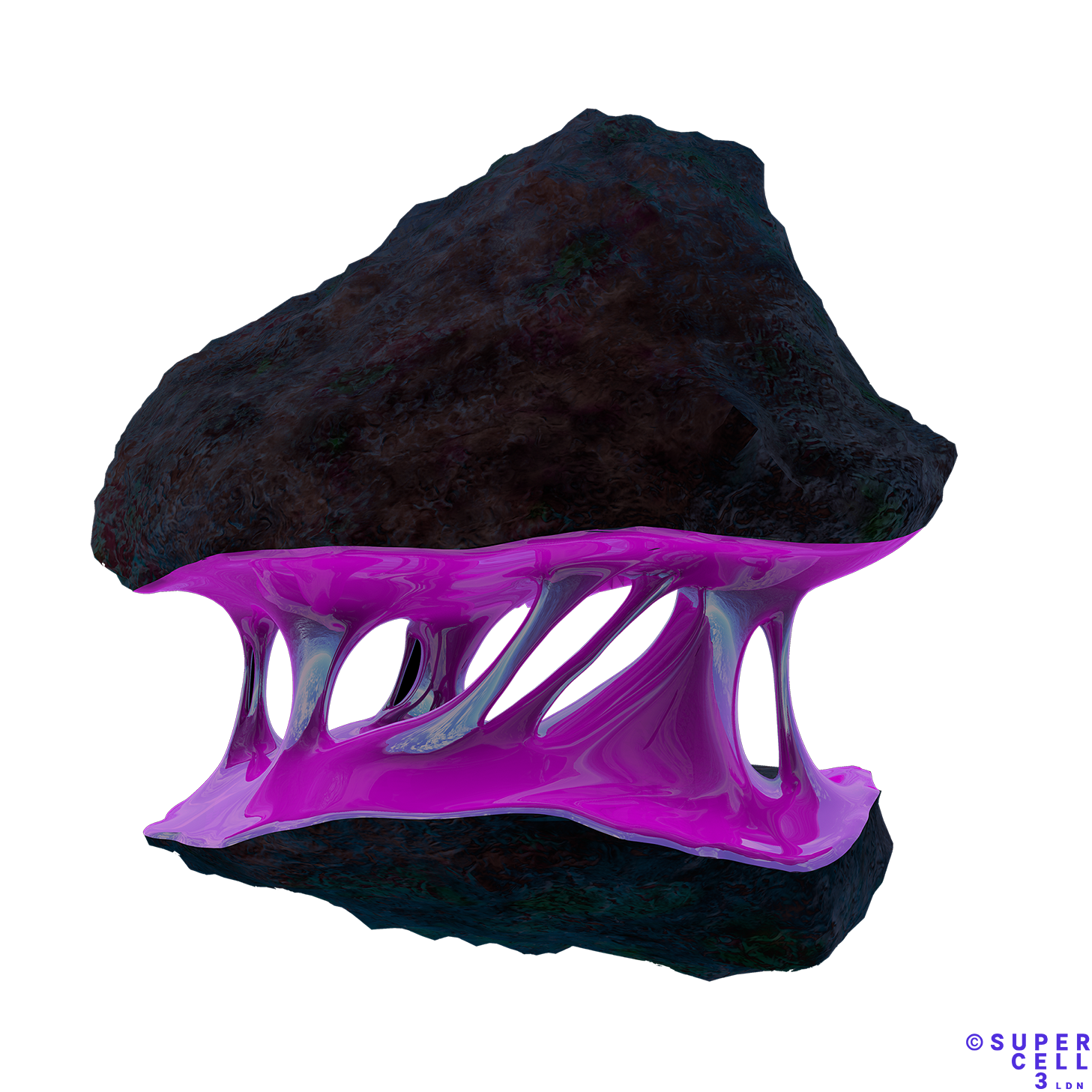
↑ the final logomark - unsure whether to eat it, or poke it with a stick

↑ first trials of visualising the creative ‘essence’
TYPE TRIBULATIONS
Whilst figuring out the logomark, it was important to give attention to the logotype, since this would be used just as frequently. I found abrasive, edgy serifs popping up on most of my experimental typography inspo sites.

↑ selection of custom typefaces, available for a small fortune from any independent type foundry 💸
From the outset, I aimed to visually combine the innate weight of ‘gravity’ with the calligraphic fluidity of ‘sketch’ - and knew the appearance of fonts had to differ accordingly.

↑ final logotype - a custom font clash
DISCLAIMER
This pitch concept case study was researched and assembled in 48 hours.
All visual research materials within this case study are used for visualisation purposes only, and remain the IP of their creators.
The Gravity Sketch logo concept remains the IP of Supercell 3 Ltd.
COLLABORATORS:
Cesar Augusto, 2D/3D Motion Designer from Monterrey 🇲🇽